It’s time to face it – no matter how much you streamline, eliminate complexity, and empower the team, some projects can never be visualised on a card wall. At least, not one with only two dimensions. Even when using different card sizes, colours, horizontal and vertical positions and even shapes, some projects have so many important things to track that cards attached to a wall just can’t express all the variables.
This conundrum has recently inspired many thinkers around the world to take up the challenge of a third dimension for their wall. Nick Thorpe from ThoughtWorks and Fiona Siseman from LunaTractor are the curators of agileboardhacks.com who, acting as anthropologists, have documented how different organisations have approached the 3D card wall challenge.
They start us off by looking at the recent work of General Motors and Wellstar Health System. Together they developed a 3D board system that served the needs of both companies, despite their different industries.
General Motors use their new board to track the need for under warranty repairs on their products. On the General Motors LEGO board, each block represents a car which needed repairs under warranty. The rows represent the faulty area of the vehicle, and there is a separate section of the board for issues which have been contained or solved on the assembly line. The height of the block itself represents the severity of the problem, and the board also uses columns to denote the time it took for the fault to appear, and colours and labels to further define each block.
“The problem they’re solving here is ‘how do we decide what should we start next?’” says Nick.
Wellstar Health System use the same idea for their 3D wall, but have adapted it for the health industry, using it to improve on wait-times for medical consultations and quality of care.
What fascinates Nick most about this particular wall is the automotive industry is where the Lean principles came from. “I see card walls all the time where the vertical and horizontal space is used well but, and this happens more in the product space than the execution space, the cards become stacked on top of each other and often the order is important. Once again it’s the automotive industry showing us how to visualise the problem of what do we work on next.”
⁂
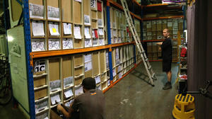
The next 3D wall belongs to Baum Cycles, a bicycle factory based in Geelong, began their engagement with Agile and Lean practices in an attempt to improve their speed of operation, communication and staff cooperation. “Their main problem was connecting all the pieces of paper they had floating around [with] where things are up to at any point on the floor,” says Fiona.
To address these issues, James Pierce from LunaTractor helped them build a 6 metre by 25 metre rotating wall, which not only displayed all the information for each bicycle order and placed it on a timeline, but also contained all the parts needed to build the product, and all paperwork associated with the order.

Photo by James Pierce
According to Fiona, the new wall has meant that, in addition to no longer running out of bicycle parts mid-production and now being able to give their customers a reliable timeline, “they have somewhere to come together and see the entire ‘story’ of a bike, without having to look in a couple of different places.”
⁂
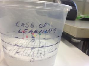
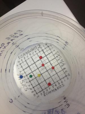
The final 3D wall, a small supermarket-style container, is used by a software developer to describe their current product (the yellow pin), the next iteration (the green pin), their long term goals for the product (the blue pin) and the competitors products (the red pins). The horizontal and vertical position of the pins indicate the product’s capabilities with task and command based training, and each pin’s height shows how easy the software is to learn and use.


“This is solving the problem of ‘What should the product become?’” says Nick.
Representing this information wouldn’t be possible with a traditional 2D card wall. The three factors that need to be tracked all exist on spectrums. You can easily represent two spectrums on a wall with the left-right and up-down directions. The third is trickier, and annotating the cards by colour, shape or dots doesn’t solve the problem. Colours and shapes are useful for adding yes/no properties. In order to compare relative position of ‘cards’ they need to be visualised on a spectrum.
An added beauty of this ‘wall’ is that it is handheld. The developer is not only able to track what is important for their system, but is also able to take the system with them from place to place.
“It’s the ultimate elevator pitch,” says Fiona.